

Featured
Elevating the design for Briteway, an accessible train travel and wayfinding app
Age-inclusive UI, UX and product positioning for a project funded by Design Age Institute
Sector
Discipline
Client
Brightyellow
Relevant links
Year
2023-24
Expertise
UI · UX · Branding · Product messaging · Copywriting
Overview

The challenge
Review the UI and UX for Briteway, a train travel planning and wayfinding app for people with access needs, for a beta launch

What we did
Designed a frictionless, consolidated, accessible platform, with clear recommendations for Briteway’s development team to action

The outcome
A clearly defined proposition, in a strong position to secure partnerships with more train stations in England and Wales
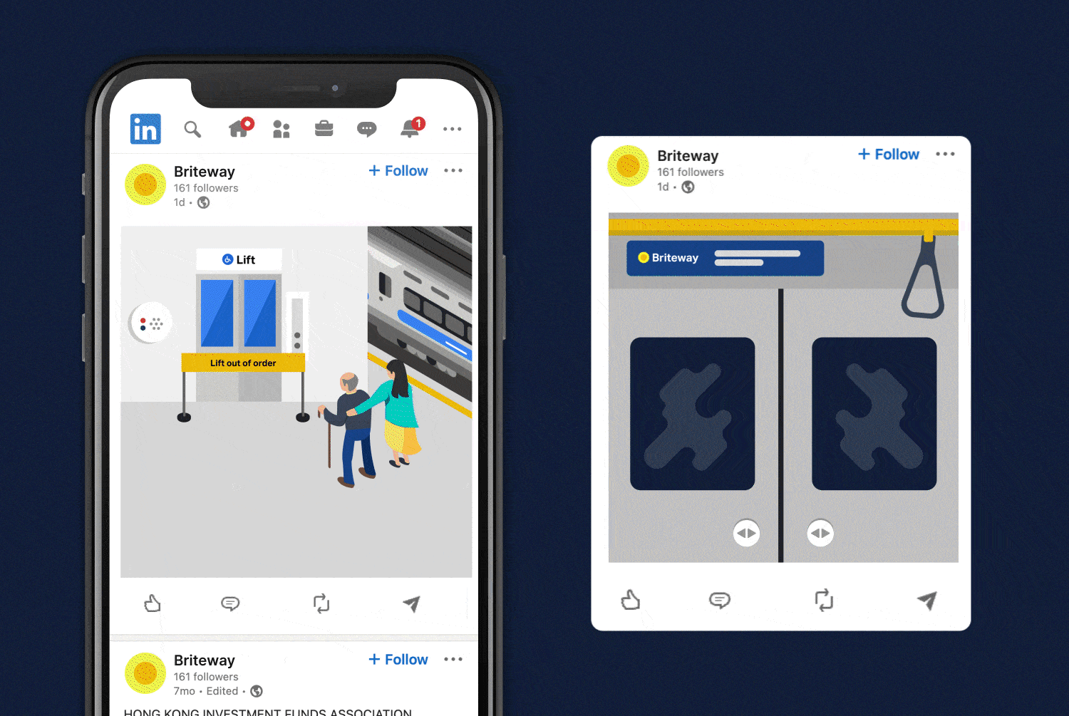
Indoor wayfinding company Briteyellow had created an early prototype for a navigation app, Briteway, for Transport for Wales. Briteway helps people with reduced mobility or disabilities find their way around train stations. After winning funding from the Design Age Institute (with whom we are rostered as a creative agency), Briteyellow wanted us to help develop the full product for a beta launch.
Using live 3D images, Briteway helps people avoid obstacles, stairs and disruption by showing accessible routes, lifts and station facilities. Travellers can also plan in advance by seeing what the facilities are, such as ticket offices, cafés, shops and toilets. It’s like Google Maps for train stations.


What we did
We did a full UI and UX review and update of the app, including user testing (some online and some live at Newport train station) and created a report of our findings. We used these findings to design a new user journey, make structural amends, and redesign functions and screens that needed improvement. We then retested these with the same cohort of users to validate and iterate our changes, so that the app is easy to understand and use.


UI and UX
The product uses 2D aerial views (satellite images) for journey planning and 3D real-time images for live navigation inside stations. We improved the UI and UX for these and made them easier to access, and created a suite of icons for facilities such as lifts and escalators, so that users can find them faster.
We improved existing navigation aspects, such as images overlaid with arrows that people can follow to get around, and included ways for train passengers to call for help in stations if they need it.


Accessibility
Accessibility was our primary consideration, as we were designing for elderly and other people with mobility and access needs. We created a UI and UX that works for people with low vision, blindness, hearing impairments, cognitive impairments, motor impairments or situational disabilities. At the same time, we wanted the product to appeal to everyone. We created a user experience, including the language, that also works for their carers and for all train travellers who want to plan ahead and navigate more easily around train stations.
The product has to look simple, clear and accessible, so that all the focus is on the functions, images and navigation. We kept to the brand colours of blue and yellow and used them on a plain, light background, so that nothing detracts from the user experience.
Our typography had to be suitable for different screen sizes and meet accessibility guidelines so we chose Activ Grotesk, as it's very functional with lots of weights and legible at small sizes across different devices and browsers.


Product positioning
We repositioned the product with new messaging, a reason to believe for potential partners, and a narrative consumers can connect with. This messaging focuses on empowering people with mobility needs to get out, be independent, visit friends and family and enjoy life. It connects with people’s emotions, taking them from where they are – feeling unable to travel on their own, because they don’t know what obstacles or access to expect at train stations – to feeling confident and reassured about travelling.
Funding
Briteway has been partly funded by The Design Age Institute, which brings together designers, businesses, researchers and communities to help address the challenges and opportunities of an ageing society. This project was part of DAI’s Transport & Mobility Pathfinder Innovation Programme, supported by the UK Research and Innovation (UKRI) Healthy Ageing Challenge delivered by Innovate UK, the UK’s national innovation agency.
The outcome
Briteway is now a clearly defined proposition, putting Briteyellow in a strong position to secure partnerships with more train stations around England and Wales. The app is currently in beta, being tested by train travellers in six stations in Wales: Cardiff Central, Cardiff Queen Street, Newport, Pontypridd, Chester and Shrewsbury. As more stations are added, Briteyellow will improve the app based on user feedback, to help thousands more people feel confident about travelling by train.


